
Nonprofit
YMCA Membership
Turning Member Research into a Funded Redesign
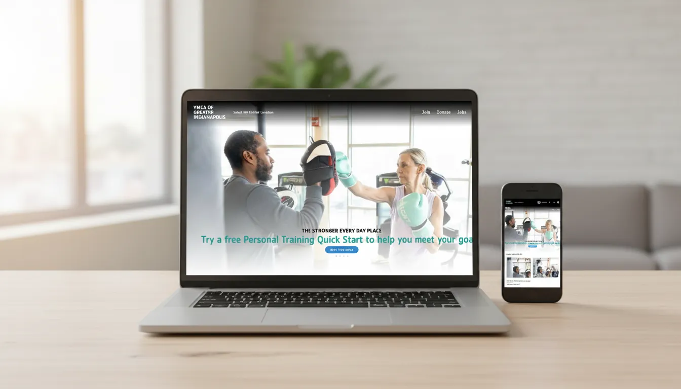
The Indianapolis YMCA knew members were struggling with its website, but the evidence was anecdotal. In two months, I led two designers through stakeholder interviews, a member survey with 1,519 responses and task-based user interviews, then turned the findings into prioritized recommendations and a prototype. The research helped win funding for a redesign, which has since launched.
At a glance
Client
Indianapolis YMCA
My role
UX lead: research, design direction and team management
Team
Me plus 2 designers I coached
Timeline
2 months
Survey responses
1,519
Deliverable
Prototype
Plus prioritized recommendations.
Outcome
Redesign
Funded and launched.
The situation
The Indianapolis YMCA knew its website frustrated members. Staff heard it on the help line and at the front desk. But the evidence was anecdotal, and for a nonprofit a redesign is a serious commitment. Leadership needed proof from real members, and a clear direction, before investing.
My role
I led UX design, research and team management. I set the research plan, guided two designers through it, and owned the recommendations we brought to leadership. The leadership challenge was balance: stay close enough to keep a two-month project on track, while giving the designers enough ownership that they grew from it.
The process
- Kickoff. We agreed on goals, timeline and the decision the research had to support.
- Stakeholder interviews. We heard what staff saw from the front desk and the help line.
- Member survey. We tested those assumptions at scale.
- Affinity mapping. We grouped survey responses into themes.
- Interviews and task validation. We watched members try real tasks.
- Synthesis and direction. We turned findings into prioritized recommendations and a prototype.
What stakeholders told us
- Online enrollment was hard to complete.
- Information was hard to find.
- The site ran on two frameworks, so pages behaved inconsistently.
- The help line kept getting the same calls.
Defining success before the research
I had us set success metrics up front, so every finding could be ranked by whether fixing it would move one:
- Fewer support calls
- More memberships started through online forms
- Higher task completion on key interactions
The survey: 1,519 responses
After reviewing analytics and internal feedback, we wrote a 15-question survey. It drew 1,519 responses, which turned staff anecdotes into evidence leadership couldn’t dismiss. Four questions carried the most weight:
- What’s the best thing about the website?
- How could we improve the website?
- How do you sign up for classes?
- How did you sign up for your membership?
What we found:
- Most members found the site hard to navigate.
- Many members were older adults, which made accessibility a priority, not an extra.
- Many preferred signing up in person and treated the website as a backup.
Interviews: watching real tasks
We recruited interviewees from survey volunteers, so every session was with a real member who had already raised a hand. Each interview centered on real tasks, like registering for a class and starting a membership. Recordings of members getting stuck did more to persuade leadership than any chart.
From findings to direction
- I mapped findings to usability heuristics, so recommendations focused on the breakdowns most likely to move our success metrics.
- We presented the research to leadership with clips alongside the survey data.
- We built a prototype, which moved the conversation from what’s wrong to what it could be.
Outcome
The research validated the problems, prioritized what to fix first and aligned leadership on a direction. The YMCA then secured funding for the redesign, and it has since launched. For a nonprofit, that’s the real test of research: it didn’t just inform the redesign, it helped get it funded.
Leading the team
I set the process and the quality bar, then gave the two designers real ownership of research and synthesis. I stepped in at the moments that set direction, and stayed out of the way the rest of the time. For a short project, knowing when to step in and when to create room was the difference between a team that delivered and a team that grew while delivering.
What I learned
A short timeline doesn’t have to mean shallow research. A survey to find the problems, then real tasks to prove them, gets to evidence leadership will act on. And the most persuasive artifact wasn’t a report: it was a clip of a member trying to sign up for a class.