
Retail
Secure Key Returns
Balancing Security and Ease of Use
Returning a software key is a security-sensitive task: every extra check protects the business and slows the user down. I led the design of the returns workflow from sketches to implementation-ready UI, wireframing live with stakeholders so the team agreed on structure before anyone polished pixels.
At a glance
Client
A Fortune 500 retailer, through a software partner
My role
UX design lead
Team
5 people
Users
Help desk staff
Context
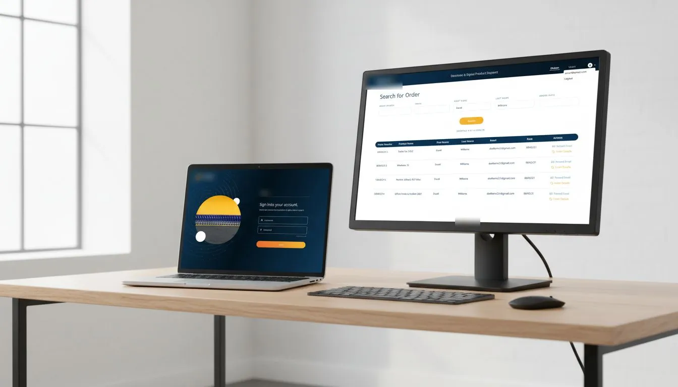
A Fortune 500 retailer needed a tool for returning software keys, built through a software partner. I was the UX design lead, working with the client’s stakeholders, the partner’s product owner and the developers.
The retailer’s help desk used the tool to process key returns.
The challenge
Returning a key is security-sensitive. Every check protects the business, and every check slows the user down. Help desk staff needed to find an order, verify it and return the key without getting lost or making a mistake they couldn’t undo.
Phase 1: Wireframes and early alignment
I wireframed live in client sessions, so stakeholders watched the structure take shape and reacted on the spot instead of reviewing a finished design days later. The same day, I confirmed feasibility with the product owner and developers. Business, product and engineering worked from one version of the plan from the start.
Key screens:
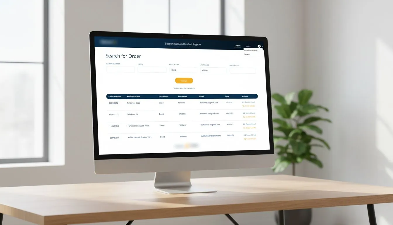
- Search for order
- Search results
- Menu system
- Filtering and table layout
Phase 2: Low-fidelity iteration
- Wording tested for comprehension and trust. Unclear copy at a verification step erodes trust fastest, so we tested it before any visual design.
- Interaction patterns settled with stakeholders, so there were no late debates about how search and filtering should behave.
- Fewer page transitions, so users stayed oriented through verification.
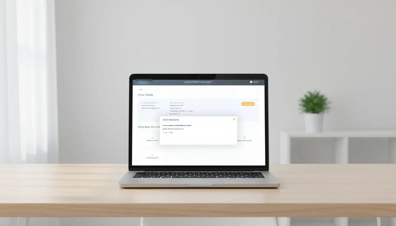
- Patterns that prevent errors, like a confirmation step before a key email is resent.
Phase 3: Final design and handoff
- Applied brand colors, spacing and visual hierarchy.
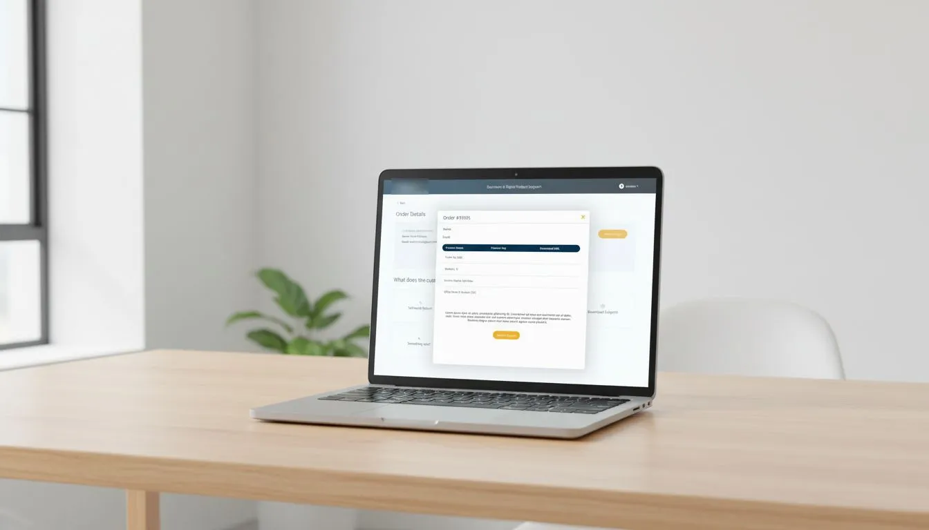
- Specified interaction details and dialog states, so developers could build what was approved without guessing.
Outcome
A secure, streamlined returns workflow, handed off with fewer surprises during implementation.
The help desk got an easier digital process for returning keys, and returned keys aren’t wasted.
What I learned
- Alignment is cheapest early. It costs minutes in a live wireframing session and weeks after polish.
- Security and usability aren’t opposites. Clear wording and fewer transitions made the secure path feel like the easy path.
- Feasibility is a design input. Same-day checks with developers kept us from designing anything that couldn’t ship.
How this shapes how I lead
This was a hands-on design lead role, not a management role, but it shows how I run alignment: put stakeholders in the room while the structure is still cheap to change, and close the loop with engineering the same day. It’s the same approach I teach the designers on my team.