
Government
State Government Digital Transformation
UX and Accessibility Across Five Delivery Teams
A statewide benefits program serves residents applying for assistance and the caseworkers who process their applications. I restructured how UX supported five delivery teams, built an accessibility testing practice the whole team could run, and set up a shared design system. Caseworker time-on-task dropped 25% and accessibility bug reports fell about 30%.
At a glance
Client
State government agency
My role
UX lead: UX, research and accessibility strategy
Team
5 delivery teams; 2 designers I directed
Timeline
2021 to present
Caseworker time-on-task
25% less
Accessibility bug reports
about 30 percent fewer
Contract
Renewed
I contributed to the renewal.
The situation
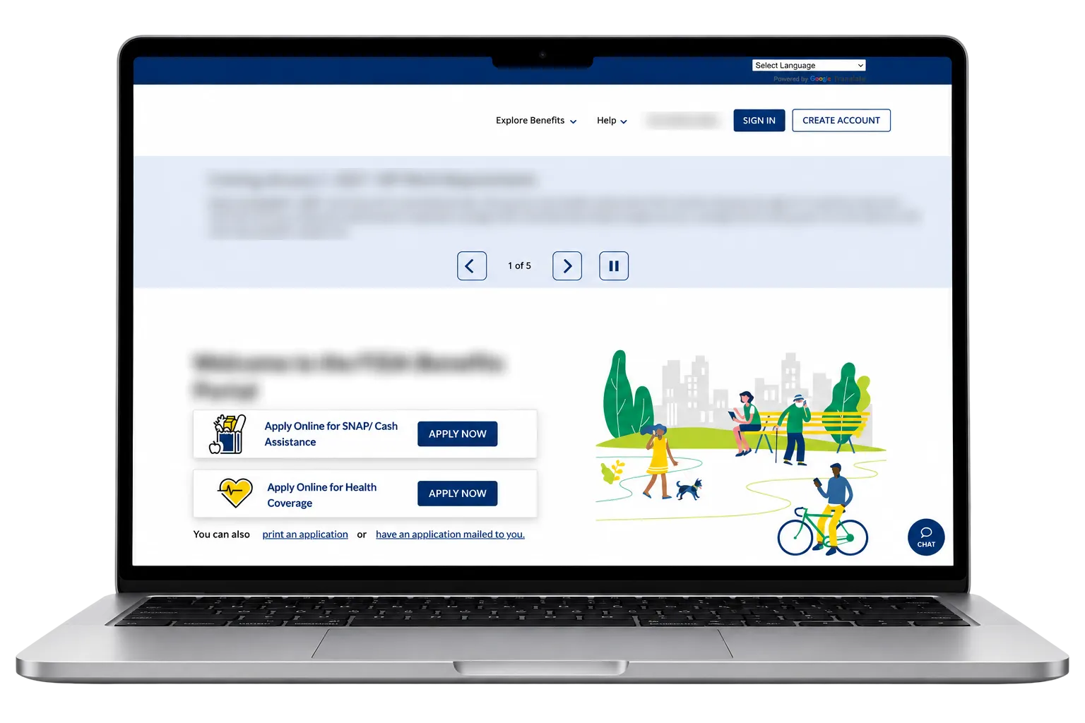
This was a large, long-running program: five delivery teams, many developers and product owners, and workflows that had been in place for years. It serves two very different audiences: residents applying for benefits, often under stress, and caseworkers who process those applications all day. My mandate was to bring real UX and accessibility improvements, restructure how UX supported the teams, and build the client’s trust in UX, all without slowing delivery.
The challenge
All five teams relied on one designer. That created a bottleneck, limited how much context any team had, and made UX feel external to day-to-day work. Design debt piled up as teams worked around the gap.
The program also faced three pressures at once:
- Accessibility legal risk. The program had a history of accessibility complaints, so every release carried risk.
- Inconsistency. Years of incremental changes had left the experience uneven from one part of the product to the next.
- Limited understanding of users. Decisions were being made without a shared picture of what each user group needed.
Constraints
- Delivery couldn’t slow down while the team structure changed.
- Security policy blocked recruiting members of the public for usability testing.
- Every release had to meet WCAG 2.1 and Section 508.
Decision 1: Restructure UX around impact
Before changing anything, I mapped what each team needed from UX and where poor experience cost the most. Two teams stood out: the public eligibility application, where residents apply, and the internal caseworker application, where staff spend their day.
- I embedded a full-time designer with each of those two teams, so design was part of their daily rhythm instead of a request queue.
- I assigned a part-time designer across the other three teams, scheduled by demand.
- I set up a shared design system so all five teams built from the same components, cutting rework and inconsistency.
The trade-off was deliberate: the lower-impact teams got less dedicated time, in exchange for deep coverage where users felt the most pain.
Before
1 designer shared by all 5 teams
1 designer
- Delivery team
- Delivery team
- Delivery team
- Delivery team
- Delivery team
After
Designers placed where users felt the most pain
Full-time designer
- Delivery team
Full-time designer
- Delivery team
Part-time designer, by demand
- Delivery team
- Delivery team
- Delivery team
Shared design system across all 5 teams
Decision 2: Govern the design system, not just build it
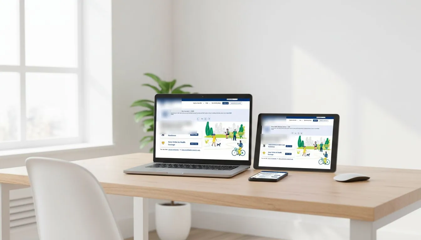
The team built the design system in Figma. My job was making it last: I defined its governance model, then presented that model to the state and to Moser leadership to win buy-in. That’s what turned it from a design file into the client’s long-term strategy for consistency.
Decision 3: Research each audience in the way that was possible
One research plan wouldn’t work for three very different audiences, so we built one for each:
- Caseworkers and staff: observation sessions, surveys and interviews on a six-month cycle. This is where the 25% reduction in onboarding and time-on-task came from.
- The public: usability testing was blocked by security concerns about recruiting. Instead of stopping, I kept momentum through education with the client and started planning analytics, so public needs could still be measured.
- People with disabilities: we partnered with a local disability organization for usability testing and built a relationship with a school for the blind.
Where research changed the plan: early on, we found that caseworkers’ day-to-day process wasn’t well understood by the product team. Design changes were being made without a clear picture of how the work actually got done. So before redesigning anything, we built a research plan to interview caseworkers and map their process end to end, and that understanding shaped every caseworker design decision after it.
Decision 4: Make accessibility everyone’s job
If accessibility belonged to one role, it would slip whenever that person was busy. So I made it part of everyone’s work:
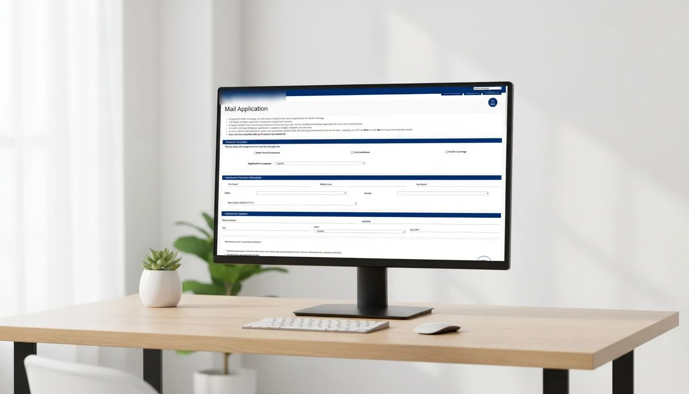
- I wrote an accessibility testing script that designers, developers and product owners could all run, so accessibility knowledge was shared instead of siloed.
- WCAG 2.1 and Section 508 checks became part of each phase of the work, not a final review.
- UX partnered with QA to check each build against the intended interactions, accessibility and real user expectations before release.
- We added retrospectives after key milestones, not only at the end of each sprint, so improvements kept compounding.
Influence: earning a strategic seat
Process changes only stick when the client sees UX as a strategic partner rather than a service team. I set up a weekly 1:1 with project and executive leadership to align UX priorities before client meetings. In every conversation, I tied UX recommendations to the things leadership already cared about: reducing risk and speeding up delivery, balanced against product ownership and development needs.
That trust unlocked more than any single design change:
- Expanded usability testing
- A seat in analytics and roadmap conversations
- Continued investment in accessibility improvements
- Adoption of the design system as the client’s long-term consistency strategy
Outcomes
- 25% less onboarding and time-on-task for caseworkers
- About 30% fewer accessibility-related bug reports once the new workflow was standard
- No new accessibility legal complaints after the process changes
- The design system adopted as the long-term consistency strategy
- Contributed to the contract renewal
What I’d do next
Add analytics to the public application, so public users’ needs can be measured even while usability testing with them stays blocked.
What I learned
- Structure matters. Changing how teams are organized moved the product faster than isolated design fixes.
- Accessibility sticks when the whole team practices it, not when one role owns it.
- Continuous improvement needs rituals, not motivation. Retros, research cycles and QA checks kept it going.
- Trust-building is a delivery skill. Without it, good ideas don’t ship.